The Role of Typography in Effective Wayfinding Design
BRI
Editorial Team
2024-02-22


AV Integration & Signage Solutions
AV Integration & Signage Solutions
Loading
Beyond Ordinary
Editorial Team
2024-02-22

In a world increasingly dominated by visual communication, navigating unfamiliar spaces can feel like deciphering a foreign language. Enter wayfinding design, the silent guide that helps us find ou...
In a world increasingly dominated by visual communication, navigating unfamiliar spaces can feel like deciphering a foreign language. Enter wayfinding design, the silent guide that helps us find our way through airports, hospitals, museums, and even our cities. While the importance of clear layouts, intuitive symbols, and strategic placement is undeniable, one often-underestimated element plays a crucial role in effective wayfinding: typography.
Imagine yourself in a bustling airport, stressed for time and desperately seeking your departure gate. You glance at a sign, only to be met by a jumble of ornate, barely-readable lettering. Panic sets in. This is the exact scenario effective wayfinding design strives to prevent.
Industry reports consistently emphasize the critical role of legibility and clarity in signage. A 2020 study by the Society for Signage and Wayfinding Professionals found that 80% of participants considered clear and concise text to be the most important factor in effective signage.
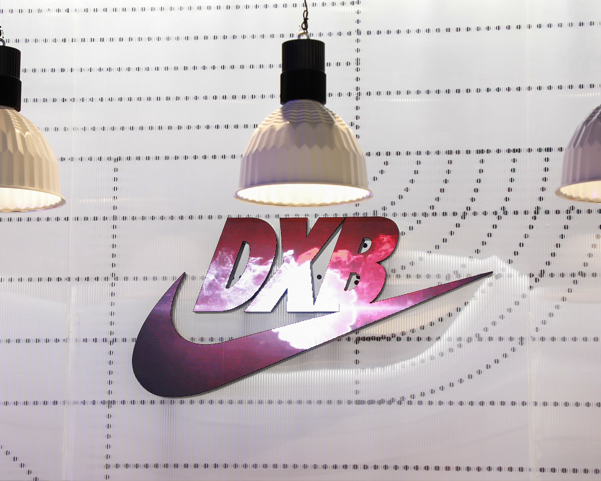
This is where typography steps in. Choosing the right typeface (font) and text size ensures information is easily readable from various distances and lighting conditions. Simple, sans-serif fonts like Helvetica or Arial are often preferred for their clean lines and high legibility, even in small sizes.
Global players like Heathrow Airport and IKEA have successfully implemented this principle. Heathrow’s wayfinding system features clear, bold typography in a consistent color scheme, ensuring effortless navigation for passengers from diverse backgrounds. Similarly, IKEA’s iconic blue and yellow signage relies on straightforward fonts and concise labels, making it easy for customers to find specific products within their extensive stores.
Effective wayfinding signage goes beyond simply making information readable. It needs to be organized and prioritized for efficient understanding. This is where typography plays a crucial role in establishing a visual hierarchy.
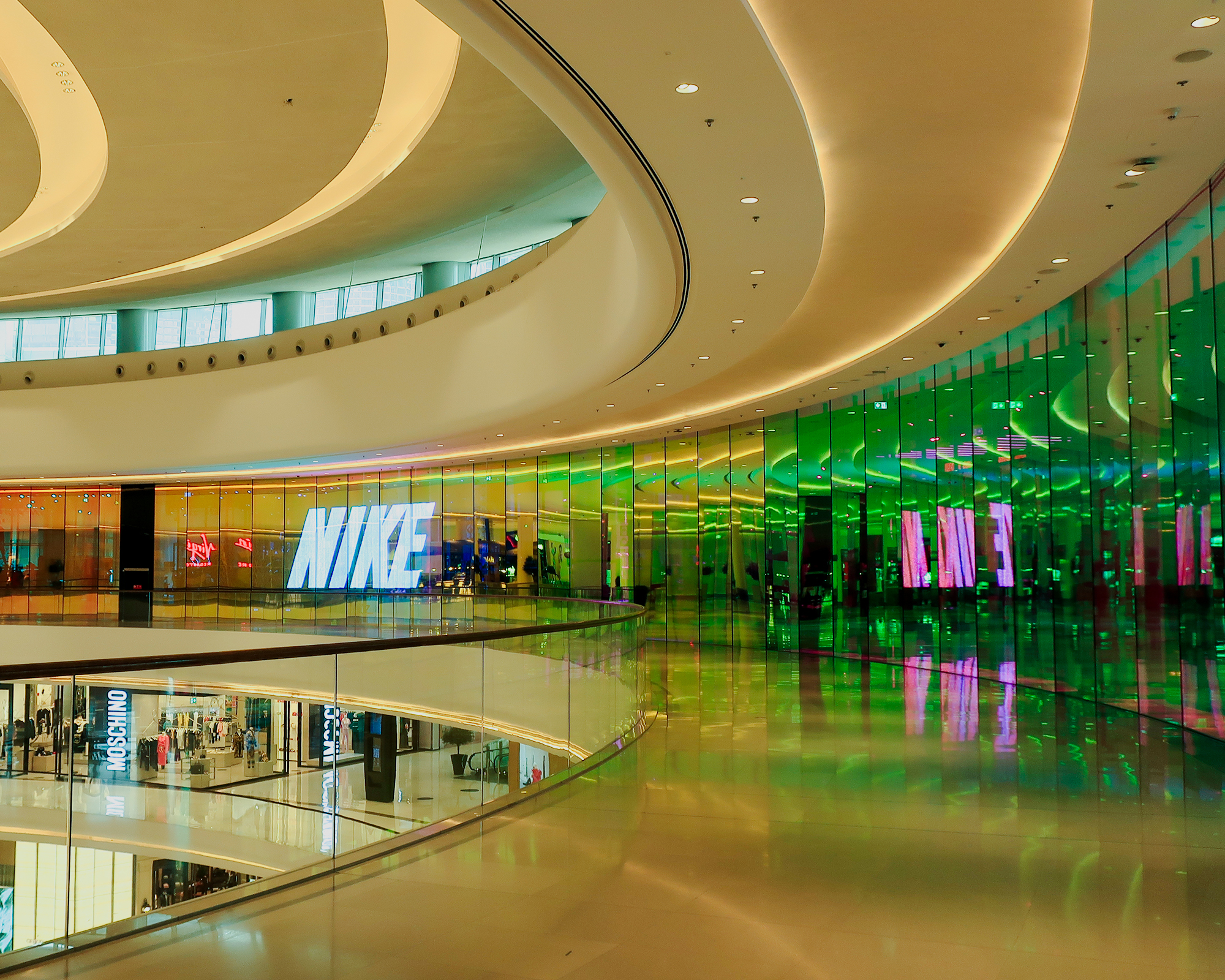
By using differing font sizes, weights, and styles, designers can guide the user’s eye toward the most important information. This can be achieved through:
Size: Larger fonts naturally draw the eye first, making them ideal for key destinations or directions.
Weight: Bolder fonts hold more visual weight, making them suitable for highlighting essential information.
Style: Italics or underlining can be used sparingly to emphasize specific details without overwhelming the user.
Disney World’s wayfinding system exemplifies this concept beautifully. Their signage utilizes a combination of clear fonts, strategic color-coding, and varying font sizes to establish a hierarchy. This allows visitors, especially young children and international guests, to navigate the park intuitively, enhancing their overall experience.
The Metropolitan Museum of Art wayfinding system exemplifies the importance of balancing clarity with aesthetics. While the primary information utilizes a clear, sans-serif font like Helvetica, the museum incorporates subtle design elements in its typography.
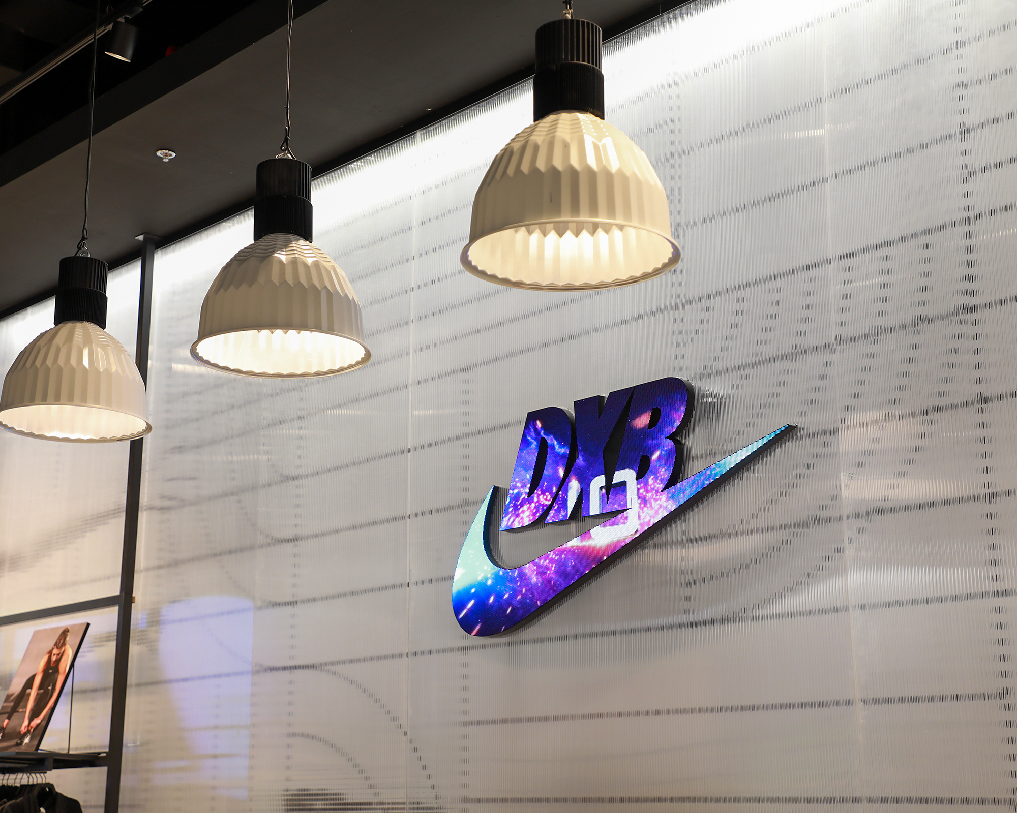
For instance, floor numbers are displayed in a slightly bolder font, creating a subtle visual distinction. Additionally, directional arrows are integrated into the typeface itself, eliminating the need for separate symbols and maintaining a clean aesthetic. This approach demonstrates how thoughtful typography can support both functionality and brand identity.
While clarity and hierarchy are fundamental principles, successful typography in wayfinding goes beyond simple formulas. It’s crucial to consider the context and desired brand image.
For instance, a historical museum might opt for a classic serif font like Garamond to complement the ambiance, evoking a sense of tradition and elegance. Conversely, a modern art gallery might choose a more contemporary typeface like Proxima Nova, reflecting modernity and innovation.
The Singapore Changi Airport, renowned for its innovative design, incorporates elements of the local culture and language throughout its wayfinding system. Their signage utilizes a custom typeface that subtly references traditional calligraphy, creating a unique and memorable experience for visitors. This demonstrates how typography can transcend its functional role and contribute to the overall brand identity and cultural connection.
Beyond aesthetics, several technical considerations come into play when selecting fonts for wayfinding.
Font licensing: Ensure the chosen font has appropriate licensing for commercial use in signage applications.
Multi-language support: If catering to a diverse audience, consider fonts that support multiple languages and character sets.
Accessibility: Choose fonts with clear letterforms, and sufficient contrast with the background, and avoid overly condensed or thin styles to ensure readability for individuals with visual impairments.
While adhering to core principles is essential, successful wayfinding can also benefit from a touch of creativity.
Directional cues: Consider using arrows, chevrons, or other symbols integrated into the typeface itself for a seamless and aesthetically pleasing way to guide users.
Information density: Experiment with varying font sizes and weights to create interesting visual textures within the text, but ensure clarity is not compromised.
Interactive elements: Explore the use of digital signage or interactive displays where typography can be dynamically adjusted to respond to user interaction or real-time information updates.
Typography is a critical element in shaping user experience within wayfinding systems, emphasizing clarity, hierarchy, and contextual relevance to ensure information is understood and acted upon. Effective wayfinding design, driven by typography, transforms navigation into a seamless journey rather than a frustrating maze. Understanding legibility, hierarchy, and contextual branding elevates wayfinding from a functional necessity to an art form, guiding users with clarity, efficiency, and even delight. This exploration equips designers with the knowledge to appreciate and create informative and visually compelling signage, ensuring smooth and enjoyable navigation experiences for users in any environment.
End of Brief